Blog

Posted by & filed under Uncategorized.

We’re always on the lookout for new and interesting voices and insights from the design world. Whether it’s actionable tips for designers as they attempt to move forward with their portfolio, or just some great design hints and editorials, these are our ten must follow design and print design blogs.


1. Print
PRINT_logo_


This is a great hub for all things print design. Whether it’s design theory or design culture, there is an impressive array of design insight gathered in one place. There is an “Inspiration” section to feed the imagination of the aspiring artist, as well as a designer of the week, allowing you to gain a valuable insight into up and coming designers and general fellow-travelers.

Love is in the Paper: 11 Beautiful Wedding Invitations


2. Art of The Menu


Under Consideration logo


Art of the Menu is a subdivision of the website Under Consideration, which is a creative brand in and of itself. However, Art of the Menu is quirky and unique because it focuses on one very specific aspect of the design world – the menu. After Website #1 on our list, this is a wonderfully specific website, with a focus on a very particular niche area of the design world. The content of the site is structured around different menus from around the world.


3. Friends of Type


Friends of Type


Friends of Type is a love letter to all things graphic design and typographic. It is designed to be a resource and source of inspiration for fellow artists and designers. In short, it’s a great place for people with a love of typography. Features include the fresh daily contributions by all the main editors of the website. There are also some interesting special features on the website, including a guest designer of the month.


4. Brand New 


Brand New Logo


This is another division of the Under Consideration umbrella of websites, and is a companion site to Entry #2 in our list, Art of the Menu. Where that site had a culinary emphasis, this casts its eye on the design practices and design trends surrounding brand names. The site is shaped by conversations around corporate and brand identity.


5. You The Designer
 

UCreative Network


A graphic design lifestyle blog, this website contains some brilliant showcases and examples of graphic design, including comic books and graphic novels. It’s chockful of list posts and helpful blogs (rather like this one, eh?). Our recent favourites include “6 Gems of Unconventional Advice for Graphic Designers”. These include “learn the principles of storytelling”, and the importance of a good story to any craft.

6 Gems of Unconventional Advice For Graphic Designers


6. Spoon Graphics


Spoon Graphics Logo


Spoon Graphics is an absolute must for print designers; this is a blog which is careful to make the distinction between digital design and print design, and tailors its content accordingly. There is a whole array of useful tutorials for the aspiring graphic designer, with articles and videos, Our most recent favourite is the “Showcase of Creative Album Covers”, which covers some of the more alternative album covers.

Showcase of Creative Album Cover Designs & Illustrations


7. Grain Edit


Grain Edit banner image


Grain Edit is a site which focuses on print and graphic designs of the 1950s and 1970s. Before you start worrying it’s stuck in a bit of a time warp, it also showcases the artists who find themselves inspired by this time period. It’s content is comprised of interviews, articles and design libraries and even vintage children’s books from the time period in question.


8. Booooom
Booooom logo


This quirkily titled site is billed as a platform for emerging artists. It’s a pretty open, democratic site and is a platform not just for graphic design, but also film, music and design. Submissions are open to everyone, and operate on a monthly basis.


9. The Book Design Blog 
 

Book Design blog


The Book Design blog is a great niche blog for lovers of book design and editorial design. There are so many exciting and wonderful showcases of book design on this site, from all corners of the world. Again, there is the opportunity for artists and aspiring designers to submit their own work.



Posted by & filed under Uncategorized.

We like to think there’s no “one size fits all” approach to graphic design; that’s the beauty of the creative process – everyone’s approach is different. However, we had a quick look around at what trends various graphic designers and print artists were talking about as we began 2017. This is what we came up with…

1. Minimalism (it’s not going anywhere)


Minimalism has arguably come back into vogue, having been a popular design at the beginning of the 20th century. The flat designs and simple aesthetics which characterise minimalism have been proving a welcome remedy to the noisy, loud and cluttered designs on the market. Minimalism designs are a symbol of precision and purpose, and their popularity in 2017 shows no sign of abating; minimalist design remains cutting edge, it’s simplicity synonymous with elegance and refinement.


minimalist design


2. Hand-drawn images


In a world of “fake news ” and “alt-facts” it’s no wonder that people are looking for messaging and branding to look as genuine and authentic as possible. This may be one reason behind the sudden popularity of an image style which some may be tempted to dismiss as “childish” or somehow facile – we prefer the term “playful”. There’s also a fine art to hand-drawn images; it takes a special kind of skill to make a design seem uncomplicated.

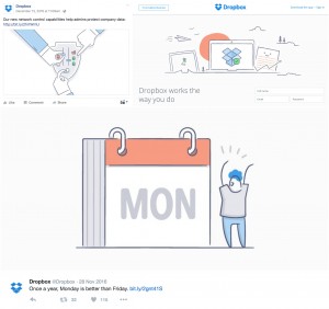
Such is the utility of hand-drawn images, you’ve probably come across them and not even realised it. Take a look at the Dropbox iconography, which uses hand-drawn images in its style.


dropbox hand drawn images


3. Form simplification


Form simplification has taken hold in the graphic designs of a few popular logos. So form simplification isn’t a trend favoured by new, disruptive upstart brands, so much as it is a marketing tool used by big-names. For example, the Mastercard logo has undergone a simplification after years of the same trusty design adorning all our credit and debit cards. The Mastercard logo rebrand has been used by a few other graphic design commentators to highlight the effectiveness of form simplification and it’s not hard to see why; the basic use of colour has stayed the same, and our brains are still used to the same familiar colours. However the form simplification has led to a design which is considerably less cluttered. Mastercard old logoMastercard new logo

There is an element of minimalism (see above) in the form simplification movement. However, this not all down to artistic temperament: form simplification is common sense in a world where we are increasingly using hand-held devices.


4. Duotone


Duotone design seems to be more of a web design phenomenon at the moment; however this doesn’t mean it doesn’t have the capacity to spread out into the other arenas of design also. Duotone has proven to be a popular trend with companies such as Spotify, who are not afraid to use a simple assemblage of bold colours in their designs. Some companies are even cheating somewhat; rather than limiting themselves to two colours, they are using a Duotone effect for simplicity, but subtly using a small group of colour palettes – Instagram are a good example of this.


Duotone images


5. Vintage


Vintage may seem like such a familiar design trend it’s almost a cliche in and of itself. But all the design commentators agree that we’re not quite ready to say goodbye to vintage as a concept. The guys over at In Design Skills think that this year’s vintage colour schemes and design motifs will take their cue from a certain other trend – mindfulness.

So how will this translate in design terms? Letterpresses and screen printing will form part of a brighter vintage colour palette, hopefully creating a fusion of old and new.

The challenge will come in ensuring that vintage logos don’t come to be totally synonymous with something old.

Vintage pallettes


6. Geometric shapes


As with many of the themes in this list, there is nothing particularly new or novel about the geometric shape as a design pattern, it nonetheless remains the case that unconventional polygons have received a renewed interest from graphic designers.

Geometric shapes


7. Negative space


Negative space was cited as one of the trends to look out for in 2016, and it looks as though it is going to remain a trend for 2017 as well. Negative space relies on a style which ensures there is more to your logo than meets the eye. Positive and negative space compete for the audience’s attention, meaning that any print or design which uses this style requires a certain amount of visual finesse.

negative space logo


Posted by & filed under Design tips, fabric printing, T-shirt printing.

Making your own stencils is a fun way to create totally customised t-shirts, whether you want to make just one t-shirt or a few. The best thing about making quality stencils is that you can use them again and again.

So, how do you make your own stencils for t-shirt printing? We’re about to take you through the simple process that will have you making your own t-shirts in no time! Read more »

Posted by & filed under Uncategorized.

Originally, in the screen printing industry, there was a trade off between the levels of printability performance on the screen and the post-production quality of the finished product. However, Permaset inks have revolutionised the industry by developing water-based screen-printing and textile inks with no compromise.

With most screen printing inks traditionally using plastisols for their ease and longevity, screen printing was harming the environment, and linked to a number of medical issues. Permaset inks are water-based, so contain no PVC or phthalates and don’t require solvents to clean screens after use. Read more »

Posted by & filed under T-shirt printing.

As a source of revenue, and as a way to build up and advertise your brand, music merchandise has always been important to aspiring bands and artists. Music is closely tied-in to an individual’s identity, and hoodies and t-shirts allow your fans to align themselves to part of a greater subculture and identify each other as fans. Read more »

Posted by & filed under Printing tips.

When you decide to paint fabric with fabric paint, the most important thing to know is that it’s not meant to be removed. This can be a problem if you make a mistake, as there’s no way to undo it. This is why you should be aware not only of what you’re painting, but everything else you do whilst painting. For example, if you have fabric paint on your hand and you’re painting a t-shirt, you’re likely to transfer the paint from your hand to the shirt. Make sure your fabric painting goes successfully with these tips. Read more »

Posted by & filed under Uncategorized.

Our last blog finished with the invention of the Gutenberg press. As well as serving as a catalyst for the Reformation and vastly increasing literacy rates throughout Europe, the Gutenberg press was a world-changing invention for everything print related. His technique of making moveable type is still not entirely clear. He was definitely familiar with casting metal from a reverse impression, but it’s unclear if he did this with sand or plaster castings. Read more »

Posted by & filed under Uncategorized.

In 21st century Britain, printing is as easy as a click of a mouse. We can see printing all around us, from the letters we receive and the books we read, to t-shirt designs and billboards. The production of mass printing facilities has come a long way over the centuries to provide us with the convenience of home printing today. Read more »